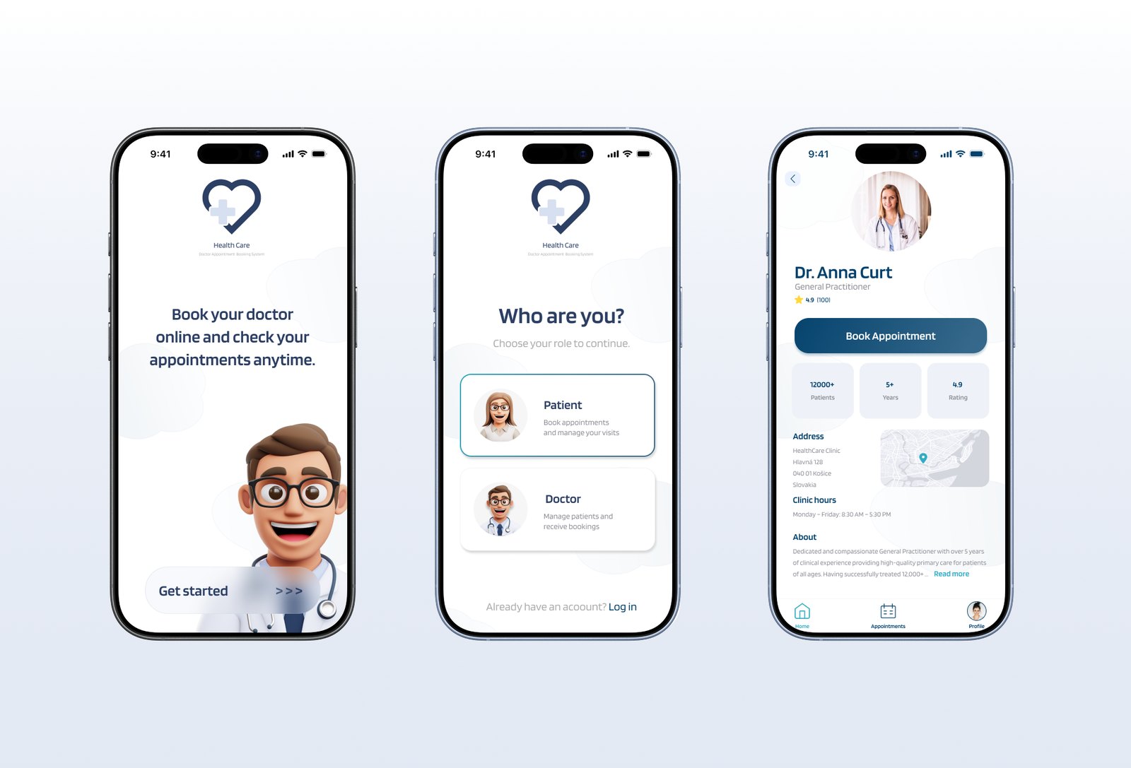
Online Medical Booking System
Helping patients in Slovakia find and book doctors. Faster, clearer, online.

Context
A team project from the SUXA UX/UI course. After completing the research and UX process as a team, I redesigned the UI independently. The original lacked visual consistency and a clear design language.
Problem
Patients in Slovakia rely on phone calls and outdated websites to find and book doctors. The information is scattered, availability is unclear, and the process is slow and frustrating.
Goal
Design a mobile app that makes finding and booking a doctor in Slovakia fast, clear, and fully online.
Secondary goals:
- Filter doctors by name, location and specialization
- Show real-time availability
- Send automated appointment reminders
- Allow patients to manage and cancel bookings online
Process

Research
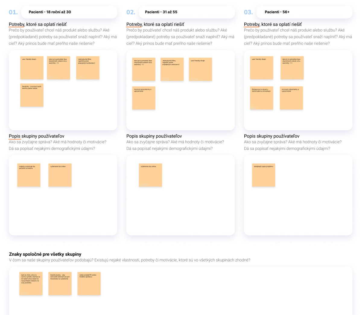
We explored how patients in Slovakia find and book doctors through user interviews and workshops. Most rely on phone calls or multiple websites with outdated information.
Methods:
- Desk research and content inventory
- User interviews (3 respondents, various age groups)
- Affinity mapping and insight synthesis
- Persona and user journey creation
- Competitive analysis
Key insights:
- Patients need fast, accurate information: availability, hours, contact
- They prefer direct online booking over phone calls
- Clear, minimal design builds trust in a healthcare context
- Older users need accessibility and simplicity
Define
We used three user personas: young adults, parents, and older users. All shared the same frustration. Booking a doctor in Slovakia is unnecessarily complicated.
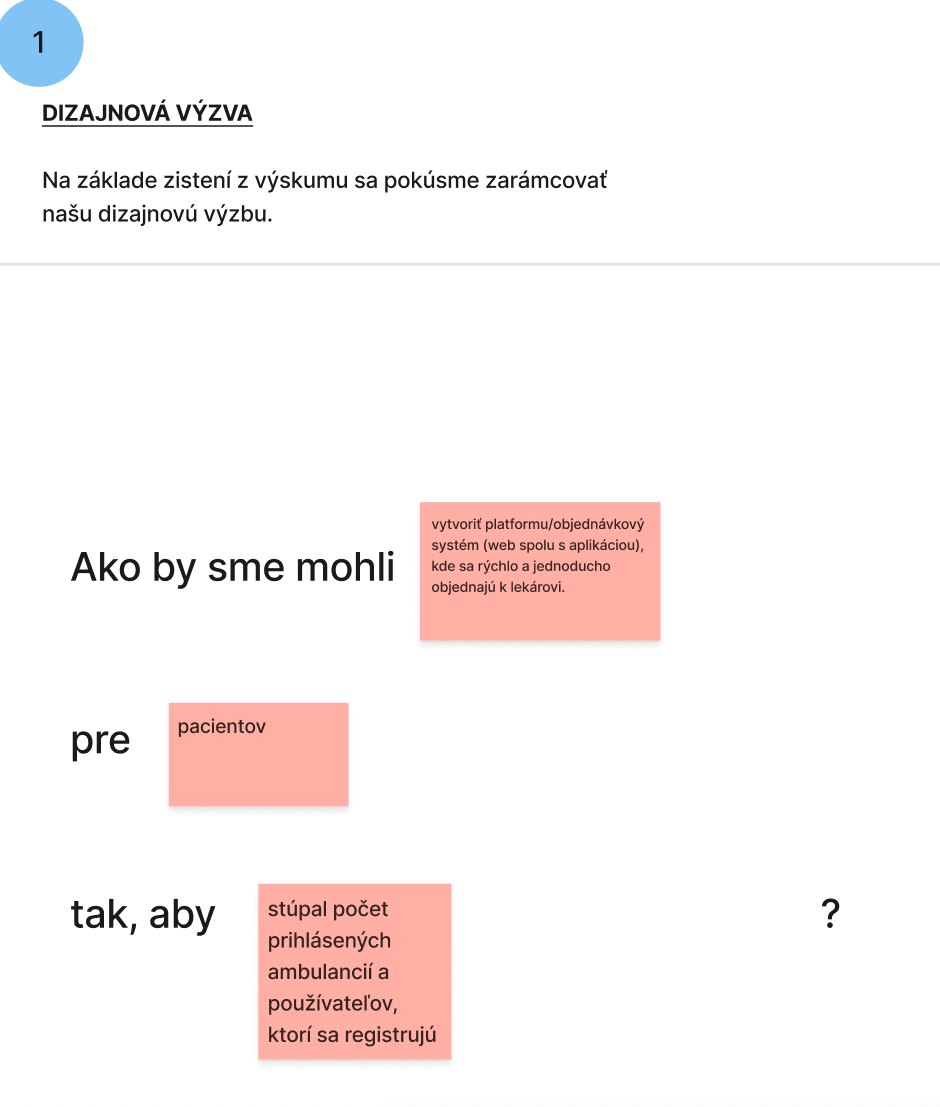
How might we…
- Help patients find a doctor by specialization, location and availability?
- Make booking simple enough for any age group?
- Give patients confidence their appointment is confirmed?
Ideate
During brainstorming part we discussed:
- Needs: overview of available doctors, waiting lists, reminders, reviews
- Frustrations: long waiting times, unclear booking flows, outdated tools
- Behaviors: users abandon booking if the process feels confusing
Solution concepts
- Central calendar with real-time availability
- Notifications for cancelled or new slots
- Reviews and trust ratings for each clinic
- Filtering by specialization, location, or type

Prototype
I designed a clickable prototype in Figma.
Main Flow
- Select if you are a patient or a doctor
- Choose a recommended doctor or apply filters
- Choose the doctor
- Book the available date and time slot
- Successful/unsuccessful confirmation
- Check your appointments

Usability Testing
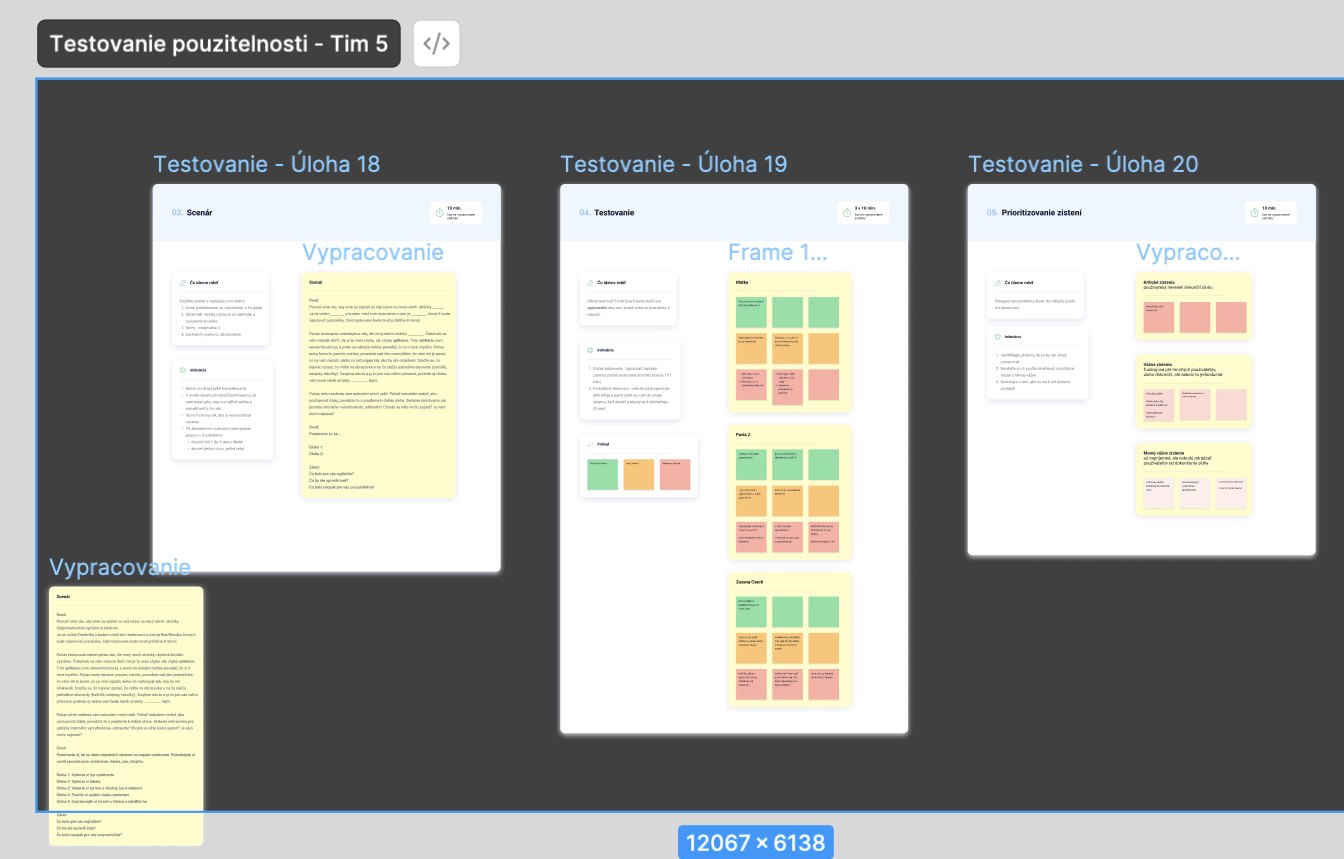
To validate our prototype, we conducted rotational usability testing in groups. Each participant took turns as:
- Moderator — guided the session and asked questions
- Note-taker — captured insights and behaviors
- Respondent — completed tasks on another team's prototype
Findings
- Flow was clear and intuitive.
- Users wanted better visual cues for available slots.
- Filters by distance and specialization improved usability.
Results & Learnings
The most difficult part was the research part and teamwork. I needed to learn new methodologies, present my ideas clearly, listen to other teammates with whom I didn't agree and come to a conclusion.
Prototyping interactions took the most iterations. At the course, we used usability testing with 3 people. After redesigning the app I tested it with 6 users across 3 rounds.
What I'd do differently now:
- Deepen the research phase
- Spend more time on the booking flow and calendar interactions