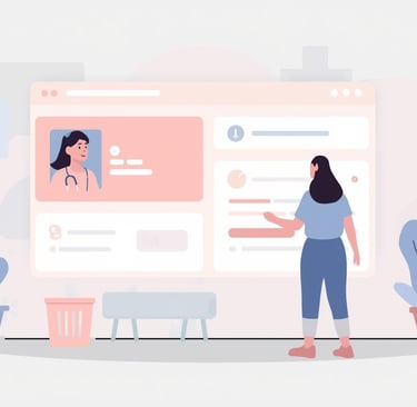
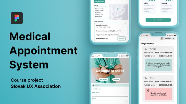
Case Study:
Online Doctor Appointment System
UX/UI Design Project — SUXA UX/UI Course (2024)
Team project of 3 UX/UI designers
Case Study:
Online Doctor Appointment System
UX/UI Design Project — SUXA UX/UI Course (2024)
Team project of 3 UX/UI designers
Overview
During the SUXA UX/UI course, our team of three designers worked on creating a digital platform that would help patients easily find and book available doctors in Slovakia.
Our goal was to make the process of booking a medical appointment simple, fast, and trustworthy.
Overview
During the SUXA UX/UI course, our team of three designers worked on creating a digital platform that would help patients easily find and book available doctors in Slovakia.
Our goal was to make the process of booking a medical appointment simple, fast, and trustworthy.
1.Research
We explored how people find doctors through user interviews and workshops. Most rely on calls or multiple sites with outdated info.
Methods:
Desk research and content inventory
User interviews (3 respondents, various age groups)
Affinity mapping and insight synthesis
Persona and user journey creation
Insights:
Need fast, accurate data (availability, hours, contact)
Prefer direct online booking
Clear, minimal design builds trust
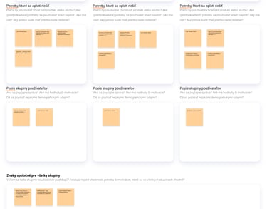
We defined three personas: young adults (18-30), parents (31-55), older users (55+) focusing on accessibility and clarity.
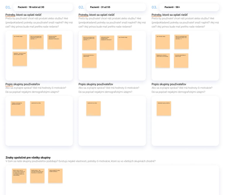
Example of early user personas and their needs.
1.Research
We explored how people find doctors through user interviews and workshops. Most rely on calls or multiple sites with outdated info.
Methods:
Desk research and content inventory
User interviews (3 respondents, various age groups)
Affinity mapping and insight synthesis
Persona and user journey creation
Insights:
Need fast, accurate data (availability, hours, contact)
Prefer direct online booking
Clear, minimal design builds trust
We defined three personas: young adults (18-30), parents (31-55), older users (55+) focusing on accessibility and clarity.
Example of early user personas and their needs.
2.Define
From our research, we reframed the challenge into a single question:
How might we help patients quickly and confidently book doctor appointments online — while making the process effortless and transparent?
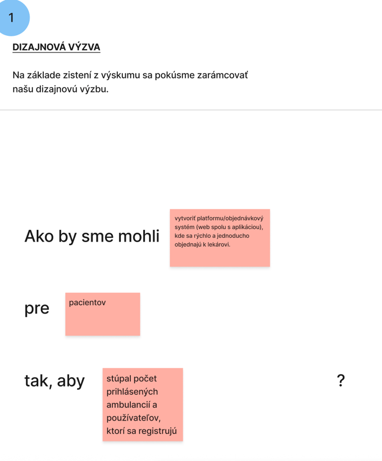
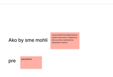
Creating How Might We questions from research insights.
2.Define
From our research, we reframed the challenge into a single question:
How might we help patients quickly and confidently book doctor appointments online — while making the process effortless and transparent?

Creating How Might We questions from research insights.
3.Ideate
During brainstorming part we discussed:
Identified Opportunities
Needs: overview of available doctors, waiting lists, reminders, reviews
Frustrations: long waiting times, unclear booking flows, outdated tools
Behaviors: users abandon booking if the process feels confusing
Solution Concepts
Central calendar with real-time availability
Notifications for cancelled or new slots
Reviews and trust ratings for each clinic
Filtering by specialization, location, or type

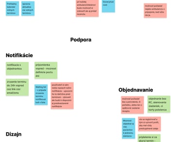
Grouping ideas into key feature categories.
3.Ideate
During brainstorming part we discussed:
Identified Opportunities
Needs: overview of available doctors, waiting lists, reminders, reviews
Frustrations: long waiting times, unclear booking flows, outdated tools
Behaviors: users abandon booking if the process feels confusing
Solution Concepts
Central calendar with real-time availability
Notifications for cancelled or new slots
Reviews and trust ratings for each clinic
Filtering by specialization, location, or type
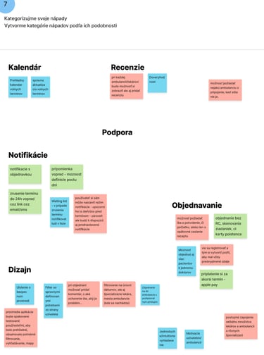
Grouping ideas into key feature categories.
3.1 Content Design
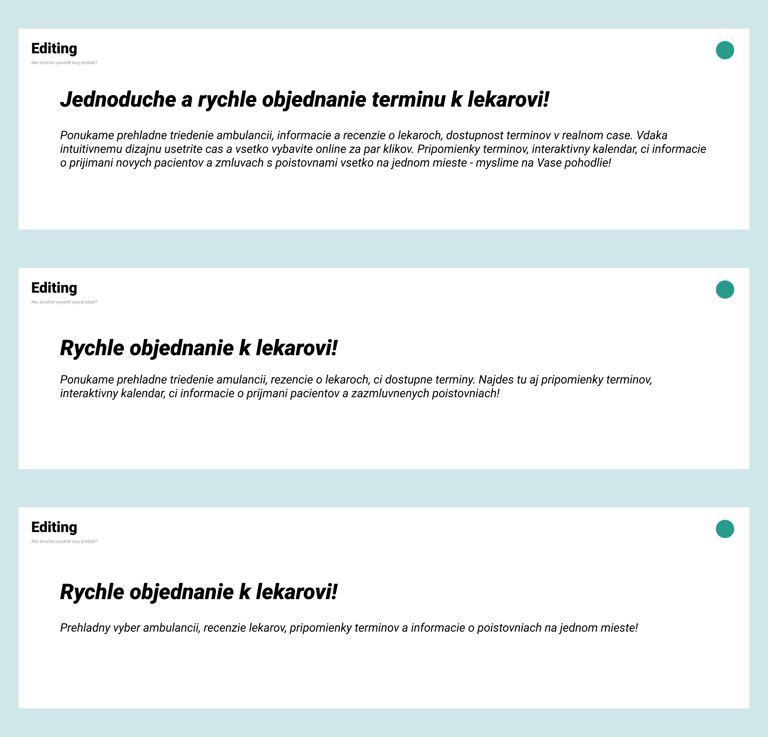
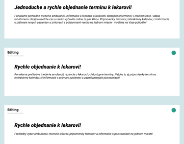
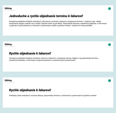
We learned the basics of content design and UX writing, practicing how to write clear and concise text for interfaces — from headlines to buttons — to improve overall user experience.
3.1 Content Design
We learned the basics of content design and UX writing, practicing how to write clear and concise text for interfaces — from headlines to buttons — to improve overall user experience.
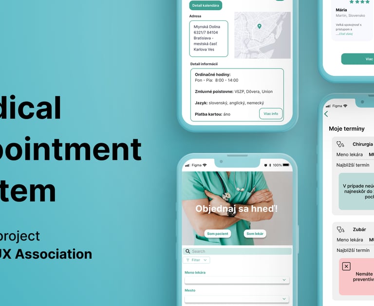
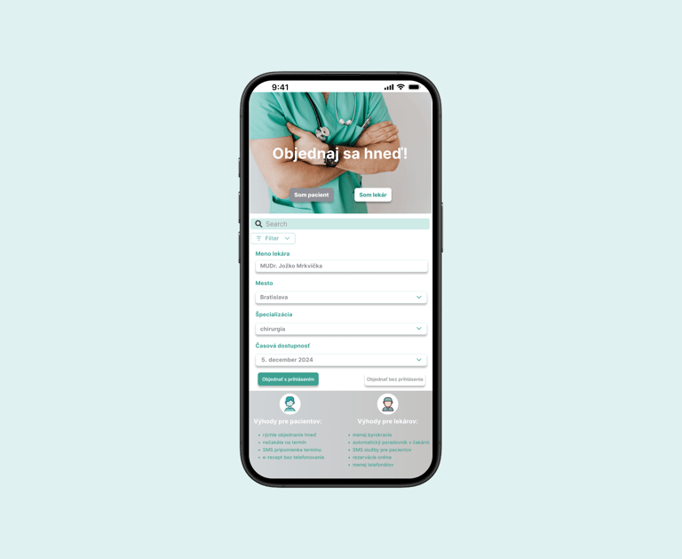
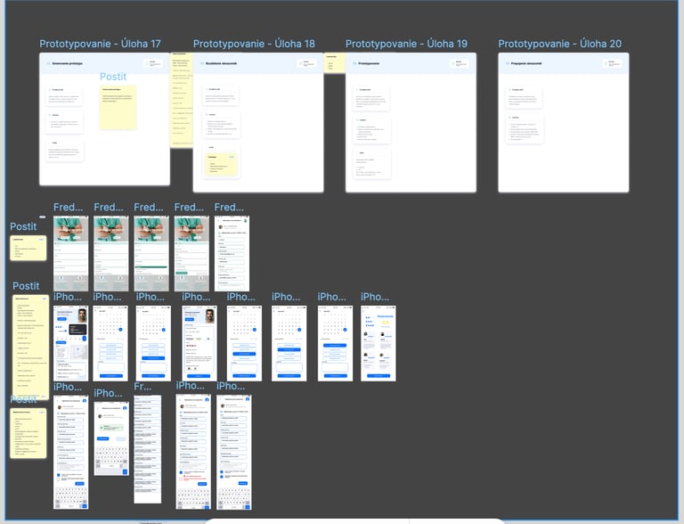
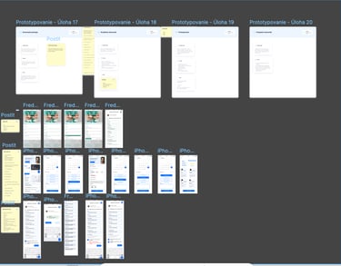
4.Prototype
We collaboratively designed a clickable prototype in Figma.
Each designer worked on different parts of the system — I worked on the Landing Page.
Main Flow
Select doctor or clinic
Choose date and time
Confirm booking
Receive confirmation & reminders
4.Prototype
We collaboratively designed a clickable prototype in Figma.
Each designer worked on different parts of the system — I worked on the Landing Page.
Main Flow
Select doctor or clinic
Choose date and time
Confirm booking
Receive confirmation & reminders
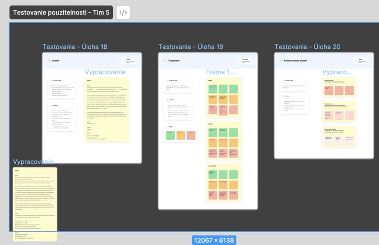
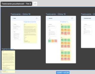
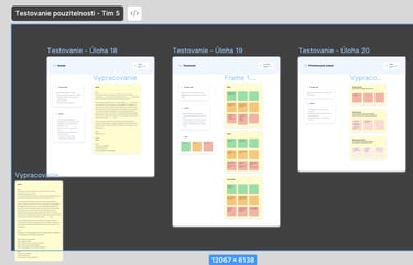
6.Usability Testing
To validate our prototype, we conducted rotational usability testing in groups. Each participant took turns as:
Moderator — guided the session and asked questions
Note-taker — captured insights and behaviors
Respondent — completed tasks on another team’s prototype
Findings
Flow was clear and intuitive.
Users wanted better visual cues for available slots.
Filters by distance and specialization improved usability.
7.Results & Learnings
Gained hands-on experience with the full UX process — from research to usability testing.
Improved teamwork, collaboration, and communication skills.
Deepened understanding of UX/UI principles and workflows.
Became more confident in Figma, prototyping, and user testing.
Learned how to ask the right questions and collect useful feedback.
Strengthened my ability to design with empathy and create simple, user-friendly healthcare solutions.