Scope 3 Dashboard
Cement Industry
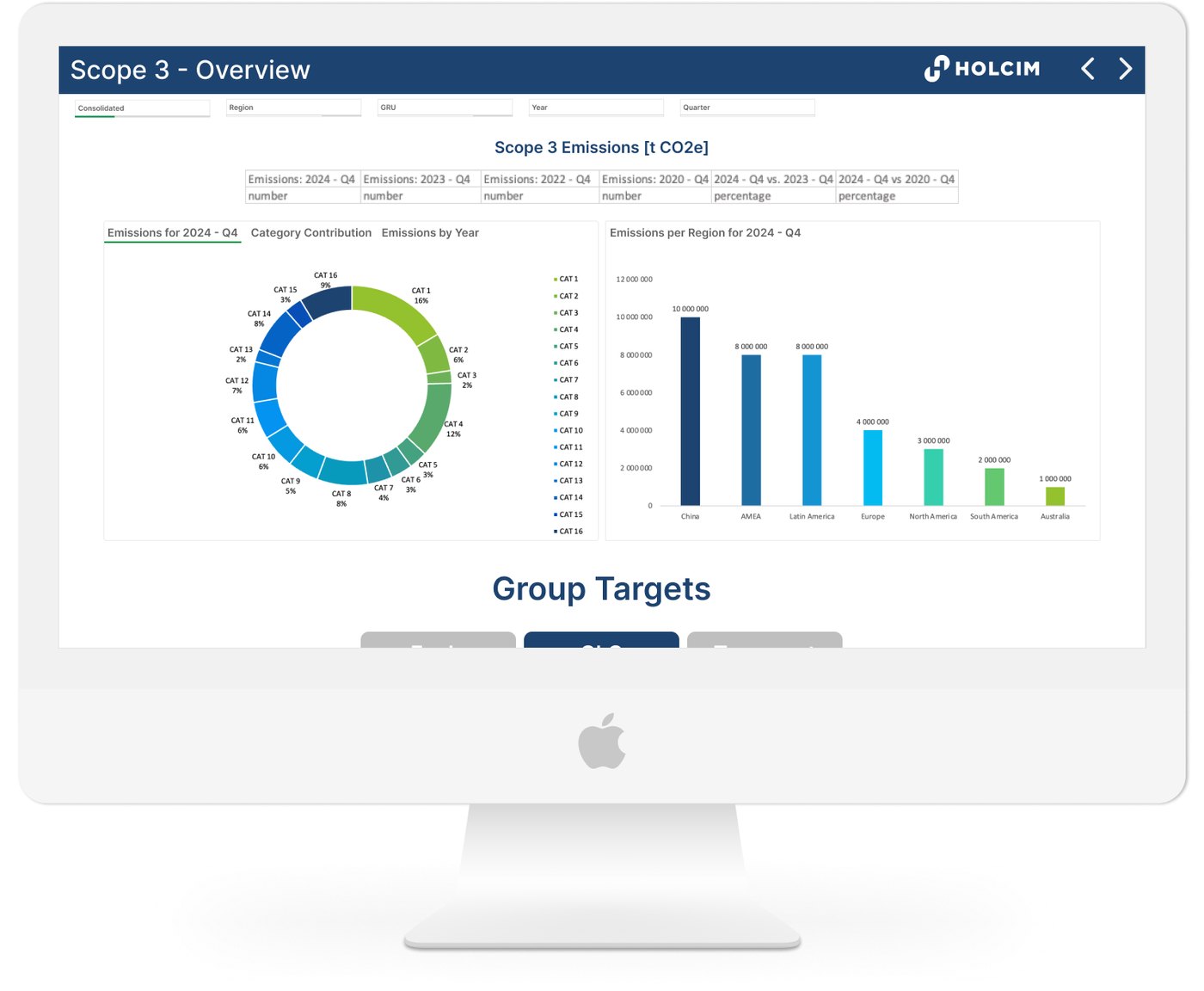
*Due to confidentiality, all data and locations shown here are fictional. The layout and interactions faithfully represent the original solution from QlikSense, rebuilt in Figma and Excel for this portfolio.
The Problem
Developers had to manually download data from multiple sources. The existing dashboard was slow, cluttered, and difficult to read. Filters were scattered, some calculations were incorrect, and Scope 3 was mixed together with Scope 1 and 2.
Moreover, this app was built in QlikView, which is less user-friendly than QlikSense.
The Goal
Separate Scope 3 into its own dedicated dashboard.
Secondary goals:
- migrate dashboard from QlikView to QlikSense
- optimise the data model
- redesign the data flow and layout
My Role
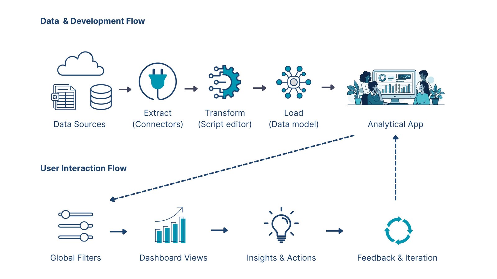
I redesigned the data model with support from a senior developer, built the entire frontend, and migrated the dashboard from QlikView to QlikSense. I also connected the database via Qlik connectors to Google Sheets, enabling automated data refresh with notifications.
The Result
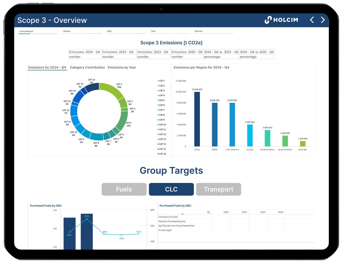
Filters consolidated in one place. Data sections organized from overview to detail to support natural eye scanning. Stakeholders could identify trends and compare countries faster without exporting or manual processing. All stakeholders involved in the project gave positive written feedback on the final result.


Research
The cement industry is one of the largest emitters of greenhouse gases globally and the company aimed to align with Science-Based Targets initiative (SBTi) goals.
I started by exploring:
- Basic knowledge about emissions, SBTi, key metrics and units
- Emission categorization in Scope 3 (16 categories total)
- Sustainability KPIs
- Existing dashboards and reports within the company
- Explored the existing data model and ETL process in QlikSense and SQL
Key Insights
- Stakeholders needed to quickly compare emissions trends across years and regions
- Users wanted interactive filtering (by region, country, consolidation level, time period) to view custom summaries
- The existing dashboard's layout made it difficult to see the "big picture"
Design process
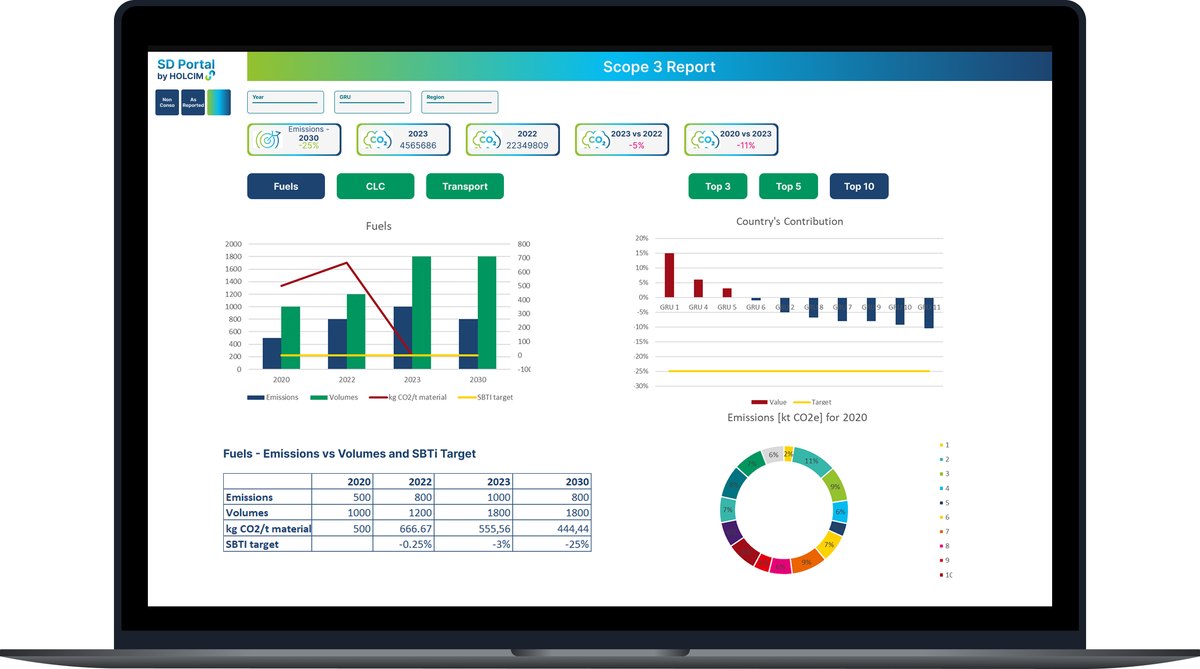
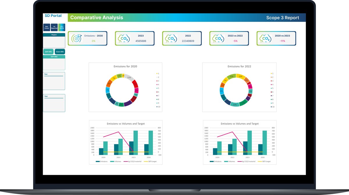
Since the original dashboard layout is not available, I recreated the structure in Figma for internal discussions. The focus was on what data to display, which chart types best conveyed it, and how to support quick, informed decisions.
Together with stakeholders, we explored different ways to visualize Scope 3 emissions across time, regions, and categories. Discussions centered mainly around KPIs and chart types, refining how insights were presented.
Color direction evolved through feedback. I began with full creative freedom, but we ultimately aligned with the company's brand palette: blue, green, and grey, with one accent color for emphasis. Each iteration brought us closer to a design that balanced data clarity, brand identity, and stakeholder preferences.


Prototype
The final Scope 3 Dashboard consists of four sheets:
- Overview
- Category Views
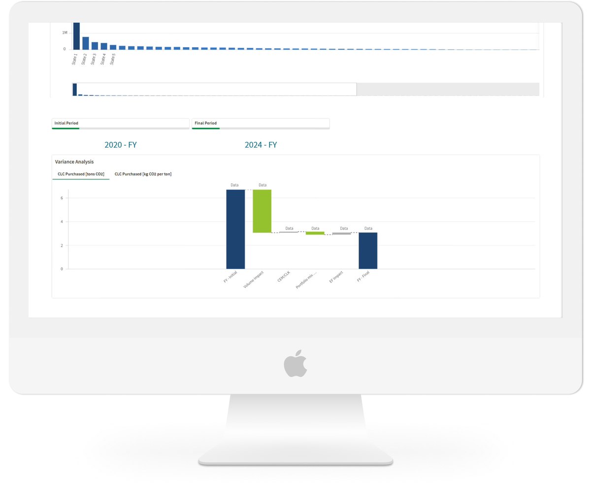
- Detailed Report
- Validation Tables
Only the Overview was designed as a visual landing page, combining KPIs and charts to tell the overall emissions story. The other sheets provided deeper analytical tables used internally for validation and data traceability.
While most of the user-facing design effort focused on the Overview, I also ensured a smooth experience across the entire app.
Test
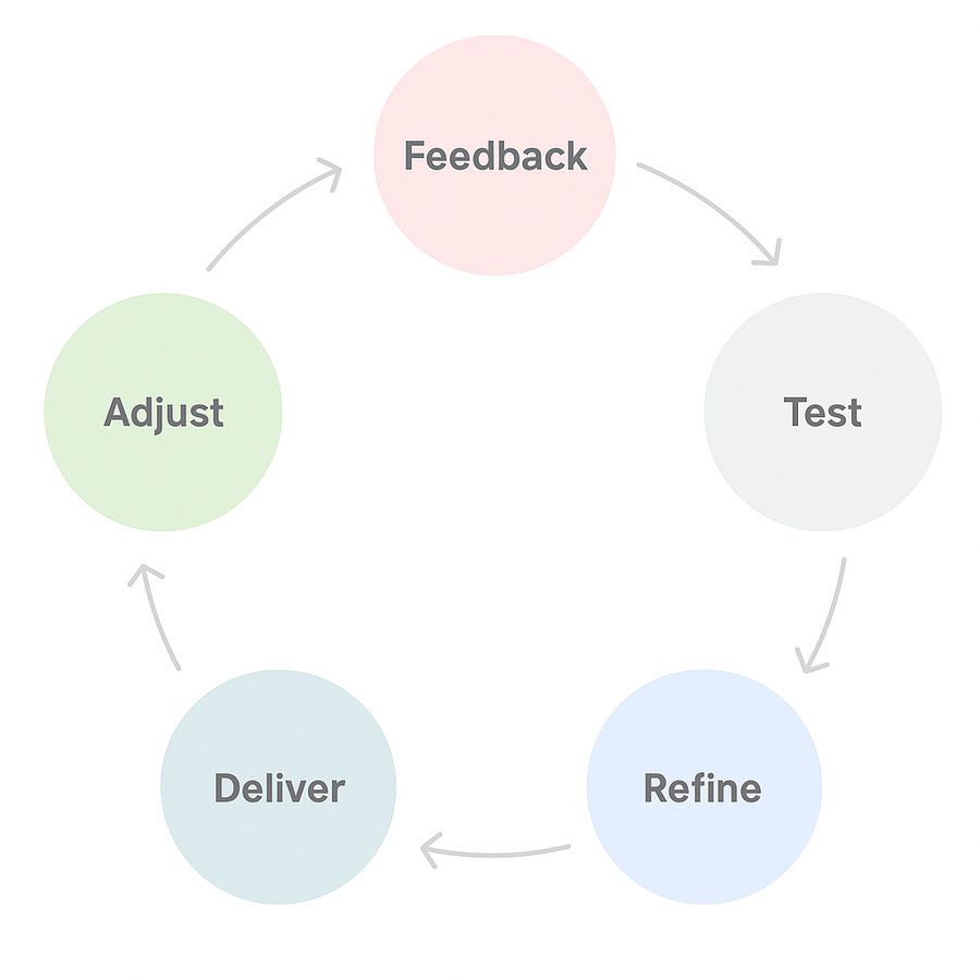
After developing the prototype in Qlik Sense, I ran several feedback sessions with stakeholders. Each meeting focused on reviewing functionality, visuals, and data accuracy directly in the dashboard.
Key feedback themes:
- Logic behind tables and charts
- Filter behavior and consistency
- Color palette alignment with brand standards
- Bugs or incorrect data values
- Placement of graphs and tables
- Adding or removing visuals, buttons, and charts
These iterative sessions helped refine both the usability and data reliability, ensuring a stable and visually cohesive final version.
Takeaways & Reflections
- I've come with limited coding experience, I learned to debug, model, and visualize data while turning complex emission metrics into clear, human-readable dashboards
- If I revisited it today, I'd focus on clearer storytelling through simpler visuals, stronger contrast, and more readable charts
- All stakeholders gave positive written feedback on the final result
- The dashboard was successfully deployed. As I left the company shortly after, I was unable to track long-term usage metrics