University Dance Center
Finding out why a dance school was losing 30–40% of its students every course
Context
A real business losing 30–40% of students every course cycle. Not because of bad courses, but because the system made it too easy to walk away.
The problem
University Dance Center had no deposit system, no digital registration, and no automated communication.
Every signup, cancellation, and reminder was handled manually by phone and email, including weekends. With no financial commitment from students, 30–40% simply didn't show up each cycle.
The goal
Reduce the student dropout rate from 30–40% to 10–15% within six months of launch.
Secondary goals:
- online registration with advance payments
- automated email and SMS communication
- self-service cancellations
- waitlist management
Process

Understanding the user
To validate the owners' hypotheses, I designed a questionnaire targeting current and former students. Eighty people responded.
As a dance instructor at the school, I also had direct access to candid, unfiltered feedback from students — the kind that formal surveys sometimes miss.
What the data showed
Dropout reasons had nothing to do with course quality:
- 31× Change of plans: family, work, schedule conflicts
- 20× Health issues
- 17× Schedule conflict
- 9× Logistical issues: course moved, no space, organisational problems
- 3× Course wasn't the right fit

Key insight
When cancelling costs nothing, students disappear. The problem wasn't dissatisfaction, it was zero commitment friction. No deposit, no digital confirmation. Even with reminders sent, students who hadn't paid felt no real obligation to show up.
Define
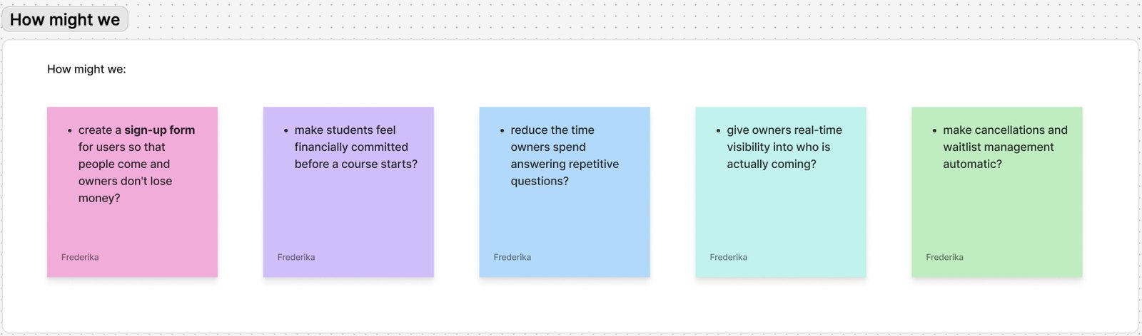
Based on the research findings, I reframed the challenge into five core design questions:
- How might we create a sign-up form so that people come and owners don't lose money?
- How might we make students feel financially committed before a course starts?
- How might we reduce the time owners spend answering repetitive questions?
- How might we give owners real-time visibility into who is actually coming?
- How might we make cancellations and waitlist management automatic?
User journey maps
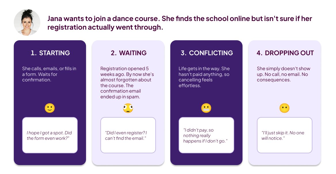
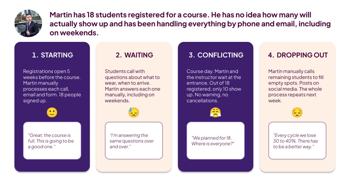
Due to the wide age range across course types — from eighteen to seventy-five and over — a single representative persona would have been misleading. Instead, I mapped two user journeys to capture the real pain points on both sides.
- Scenario 1 — a student signs up for a course
- Scenario 2 — the owner manages course day
User flows
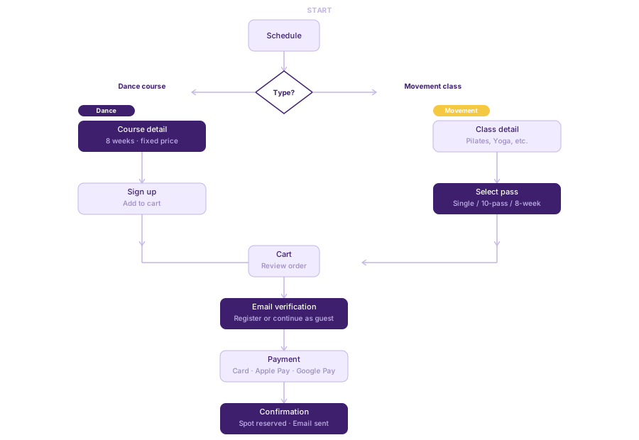
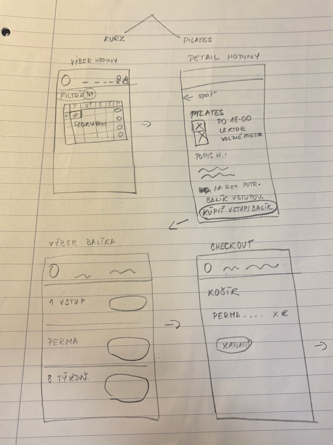
The school offers two activity types, each with a different payment model. I designed one unified flow that handles both, merging at checkout for a consistent booking experience.
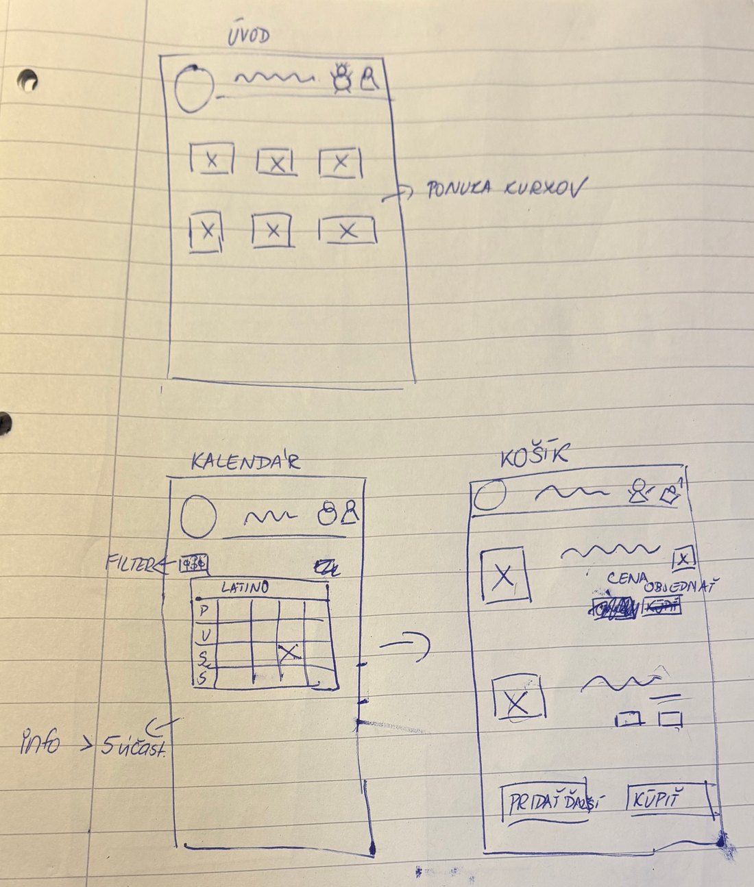
Paper wireframes
Before moving to digital, I sketched the key screens by hand. This helped me quickly explore layout options and validate the flow without getting stuck on visual details too early.

Hi-fi UI design
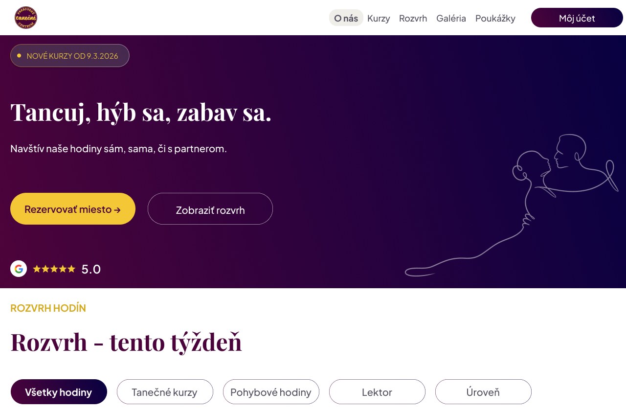
The owners wanted deep purple, warm yellow and clean white. I kept the focus on clarity and trust, and on making the booking process feel as straightforward as possible.
Before / After
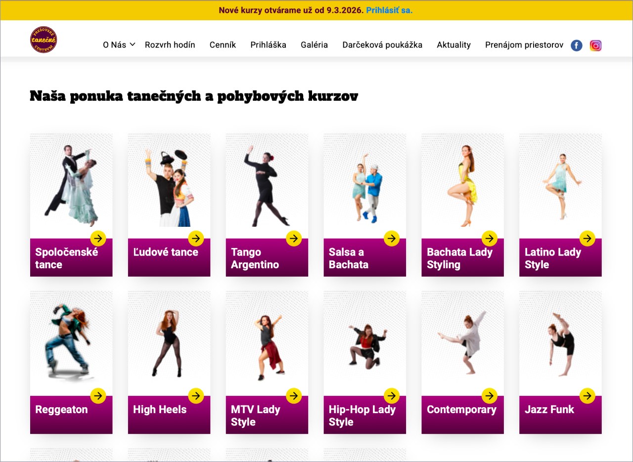
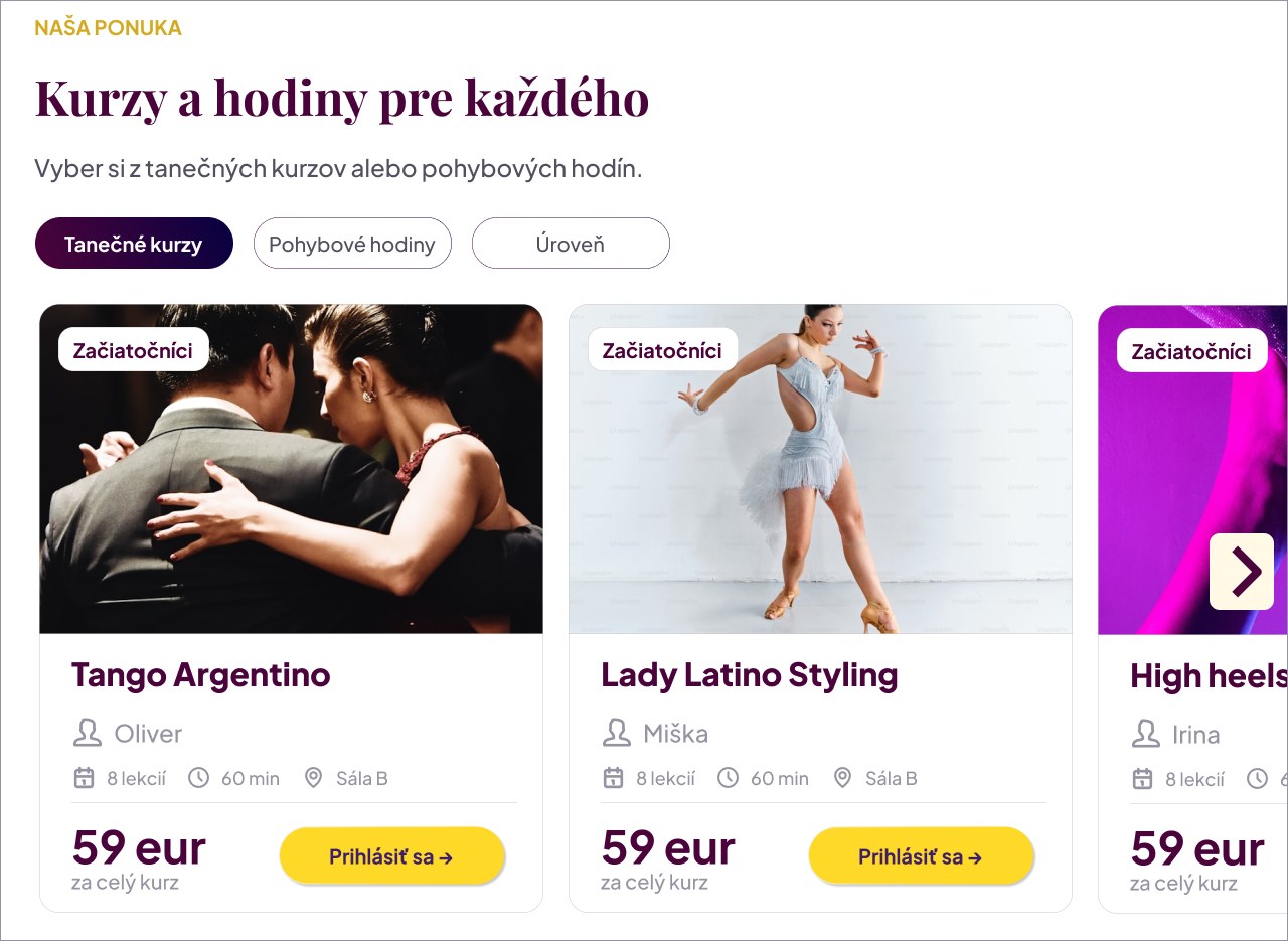
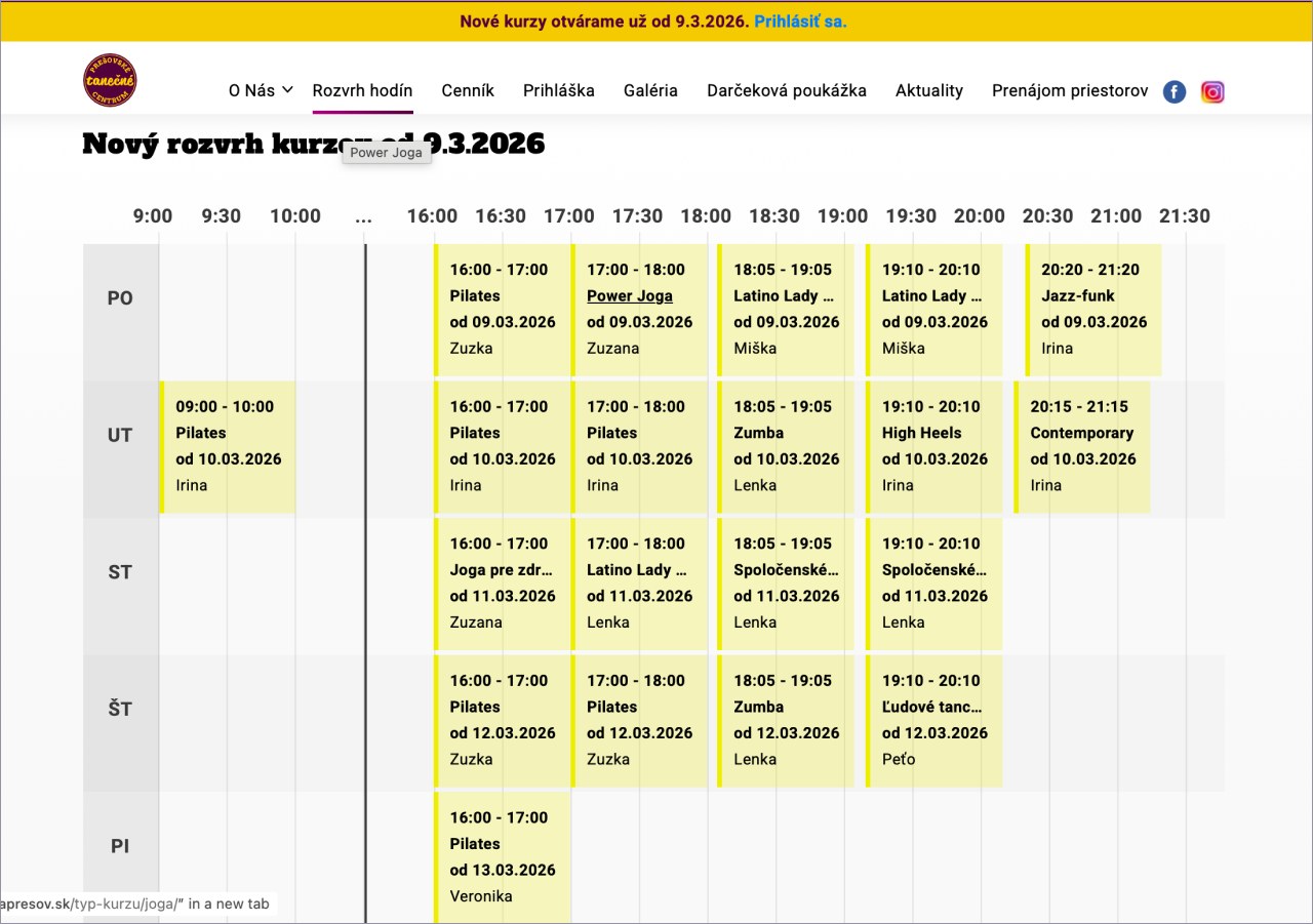
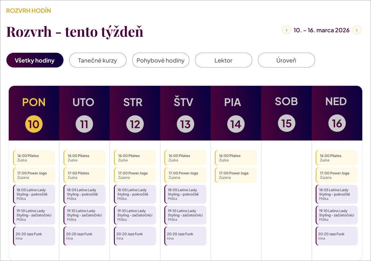
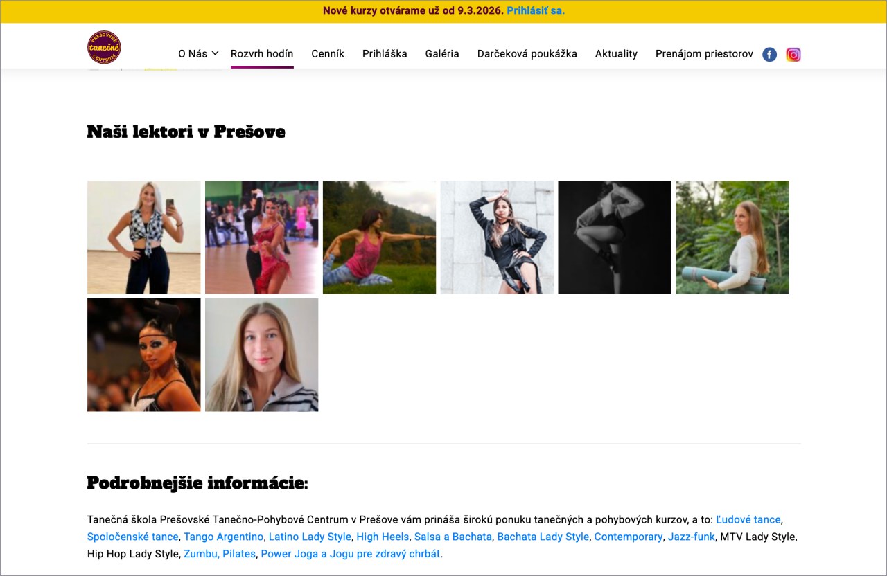
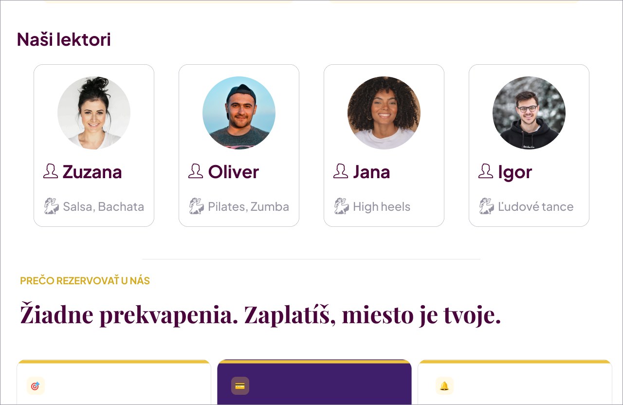
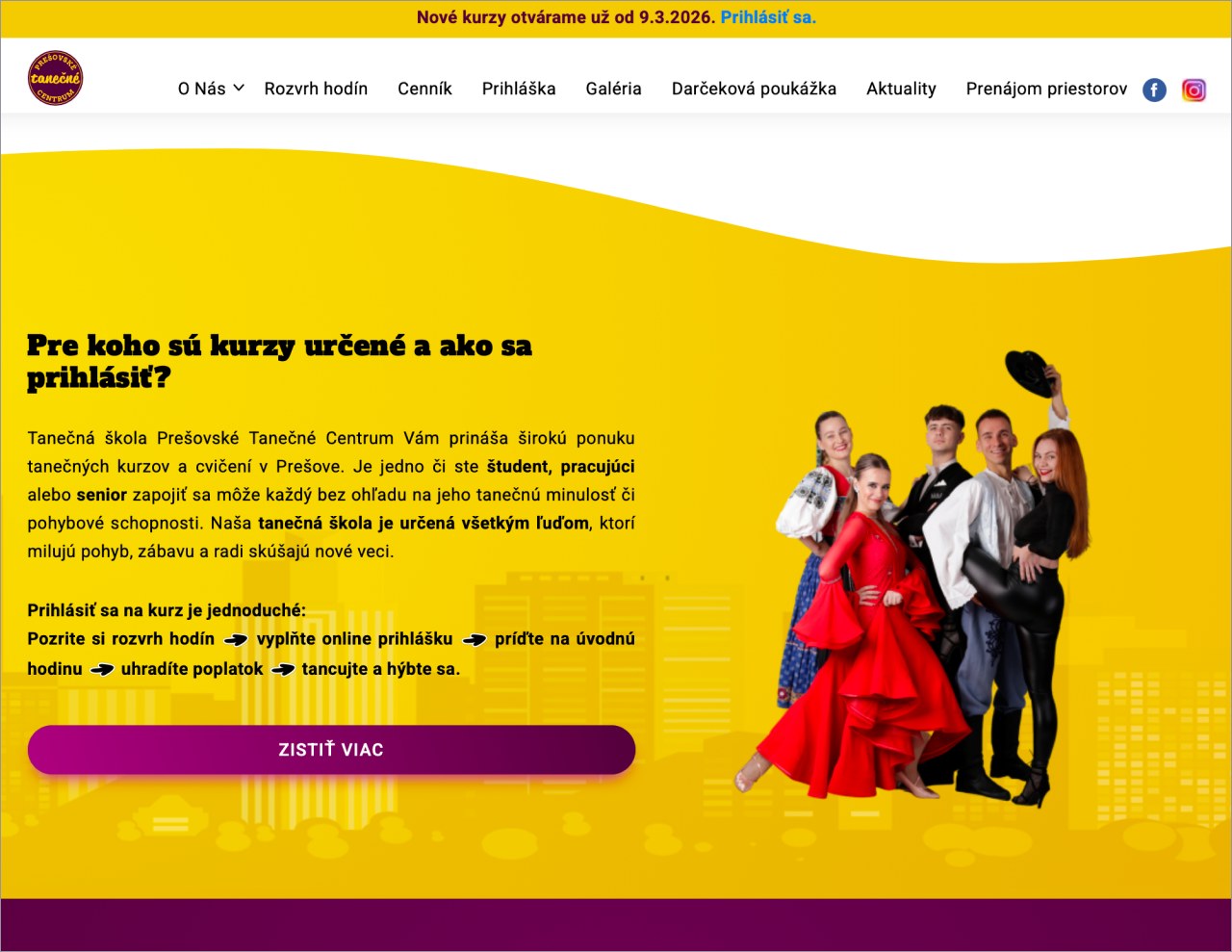
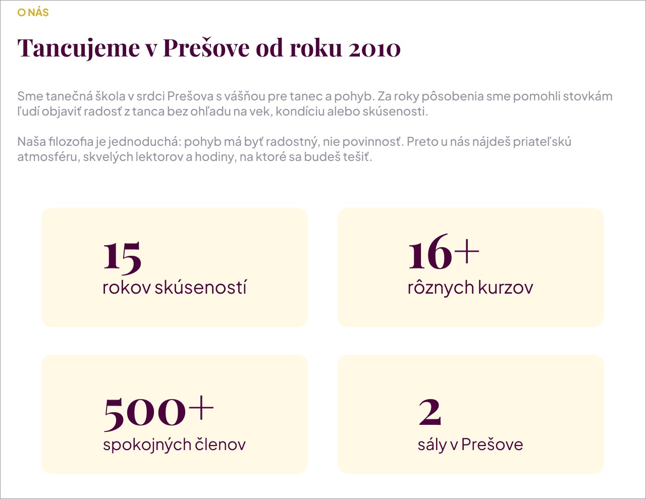
The original site was built on a template and never designed around booking. Every screen below was rebuilt around one question: can someone sign up and pay without calling anyone?
Homepage
Before

After
Courses
Before
After
Timetable
Before
After
Instructors
Before
After
About us
Before
After
Where it ended
I delivered the research, the journey maps, the user flows and the hi-fi UI design. The collaboration ended before usability testing. The client took the designs forward with their own developer.
So the problem is documented and the interface is designed. What never happened was the testing round, and the real numbers that would have come with it.